Added scheduling to Timeless beta

September 2019

I’m delighted by the feedback I received from the people who downloaded the Timeless beta over the past two weeks. The two most requested features were:

  • Displaying the indicator only on certain days.
  • Showing something useful when the indicator isn’t in use.

The latest update addresses both these requests with a new scheduling feature and the option to show a regular old clock when the indicator sits idle.
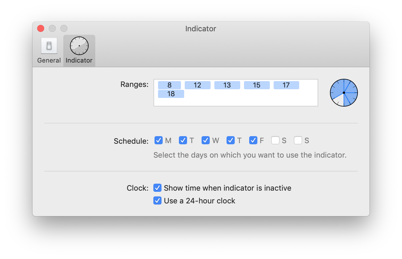
A screenshot of Timeless' indicator preferences

This means you can display the time before and after your timeless period starts and during the days you’re not working. The main goal is to reduce friction when giving Timeless a go.

A screenshot of Timeless' clock in the menu bar

Feedback

If you haven’t already, I’m hoping you’ll install the new beta and let me know what you think.

The beta includes a built-in feedback dialog that you can use.
Get the Timeless beta

August 2019

After using Timeless myself for weeks and tweaking the experience, it’s finally time to share the first beta version with you. I’m very excited about this. Try Timeless now.

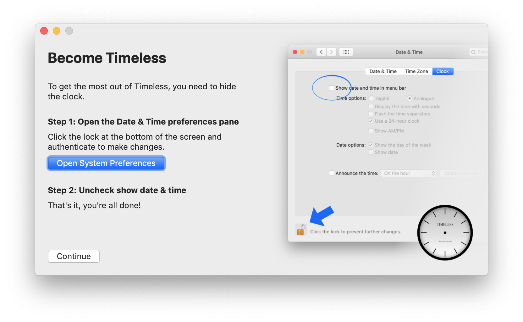
A screenshot of Timeless' setup wizard, showing how to disable the clock

Hiding the clock from the corner of my eye and switching to the less specific indicator of Timeless has allowed me to be more productive while reducing anxiety. I’m curious to hear if it does the same for you.

A screenshot of Timeless' indicator preferences

Download the beta today

After launching the app for the first time, the setup wizard will help you get started by completing the tasks below.

  1. Hide the clock from your menu bar.
  2. Define the indicator ranges.
  3. Submit bug reports, comments and suggestions.
  4. Updates to the beta will be presented to you automatically.

Announcing Timeless

July 2019

I’m working on a more natural way of getting the most out of my day: it’s an app called Timeless. At its core it gives me a generic sense of what part of the day I’m in: morning, lunch time, noon etc.

Instead of breaking concentration or induce stress it lets me continue working when I’m still in the time bracket I’m expecting to get stuff done. Then, in a glance, it lets me know that I’ve entered a new part of the day. If it’s between 12pm and 2pm I should probably get lunch.

There’s no notification to ‘get lunch now’, just a hint that when I’m ready I should probably go grab something to eat.

Even when combined with more urgent interruptions, like water breaks, it allows me to comfortably get back to work. I don’t feel any pressure or hesitance because of how much time I have left in the day.

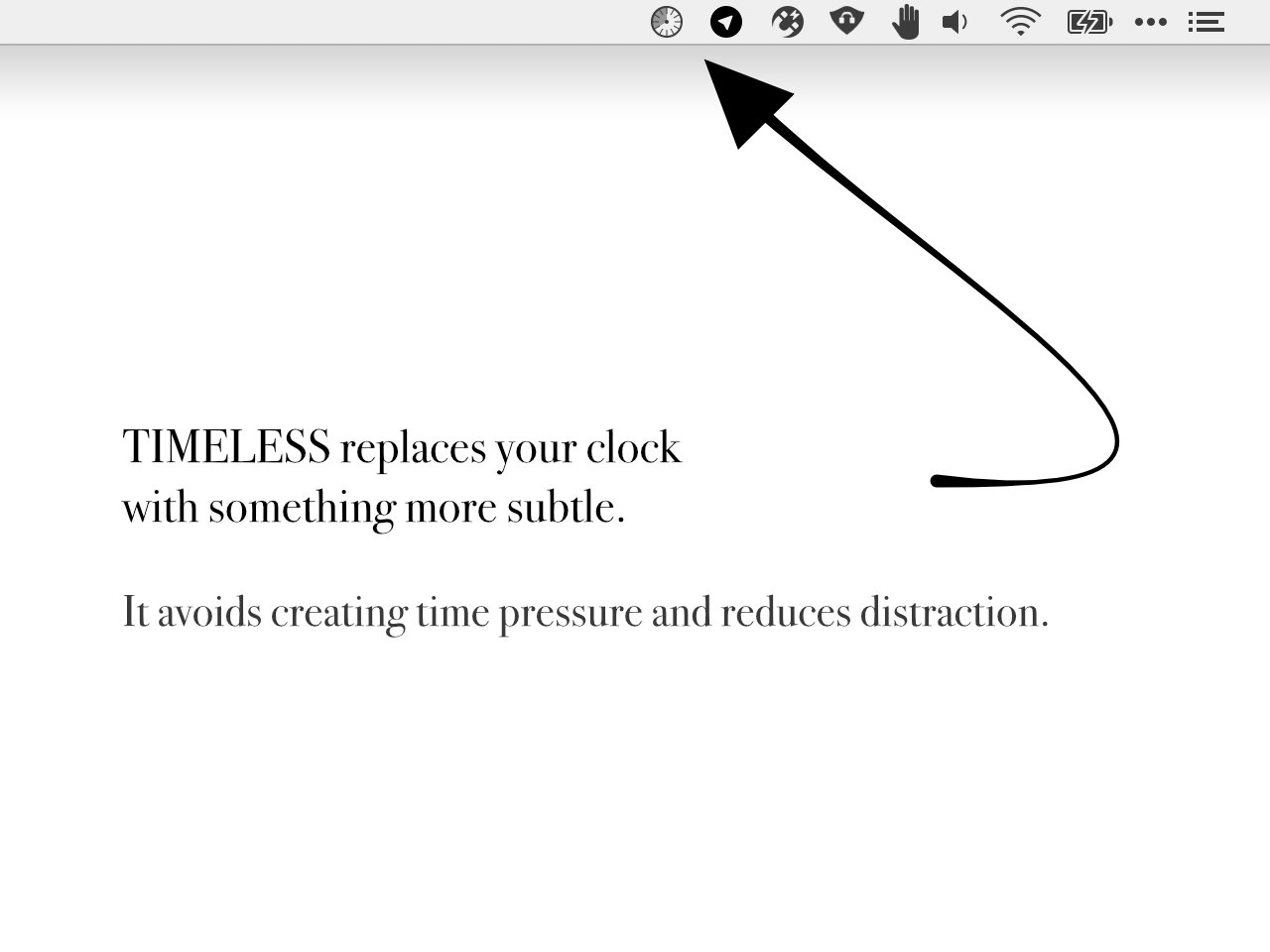
A screenshot of Timeless menu bar icon

Beta sign-up

I’m getting ready to let others give this a go as well. If you’d like to be invited to try the beta, subscribe to the mailing list. Thanks!

Toggle Pipvid based on window size

June 2019

Pipvid v1.1 was just released! 🚀

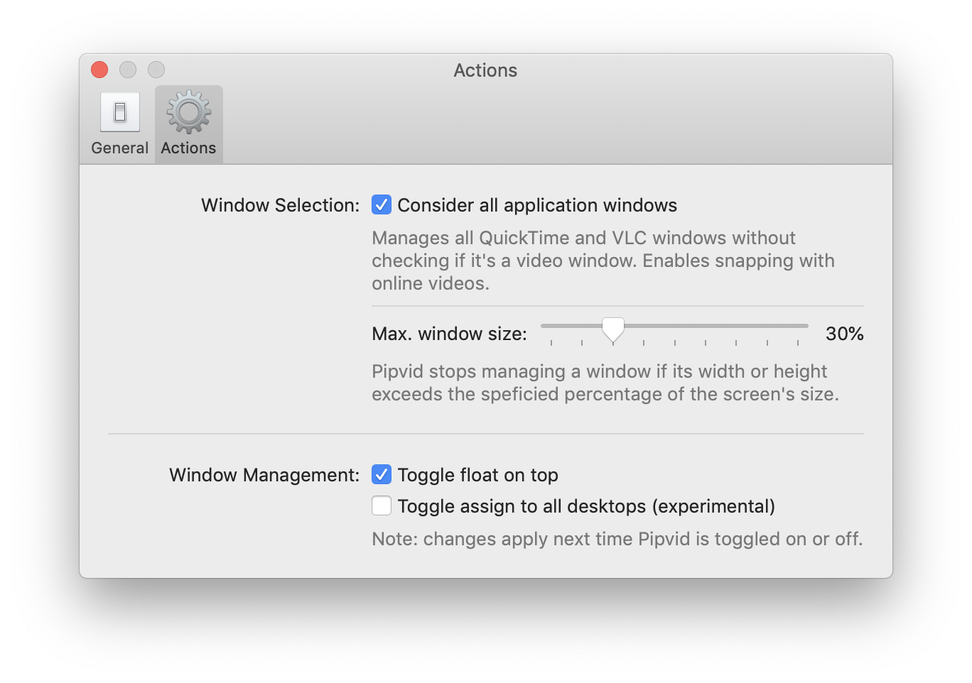
A screenshot Pipvid's preferences screen, showing the size based options

This update adds a brand new feature: it allows you to specify the maximum window size up to which Pipvid should manage it.

Using this setting means you can keep Pipvid turned on, use the player window as normal when it takes up a certain part of the screen, then shrink it down and Pipvid will automatically snap it into the corner. It’s size based automatic picture-on-picture mode. 👌

Get Pipvid today!

Introducing Pipvid

June 2019

With Pipvid both VLC and QuickTime gain a picture-in-picture mode. Ideal for watching videos in the corner of your screen while you work on something else.

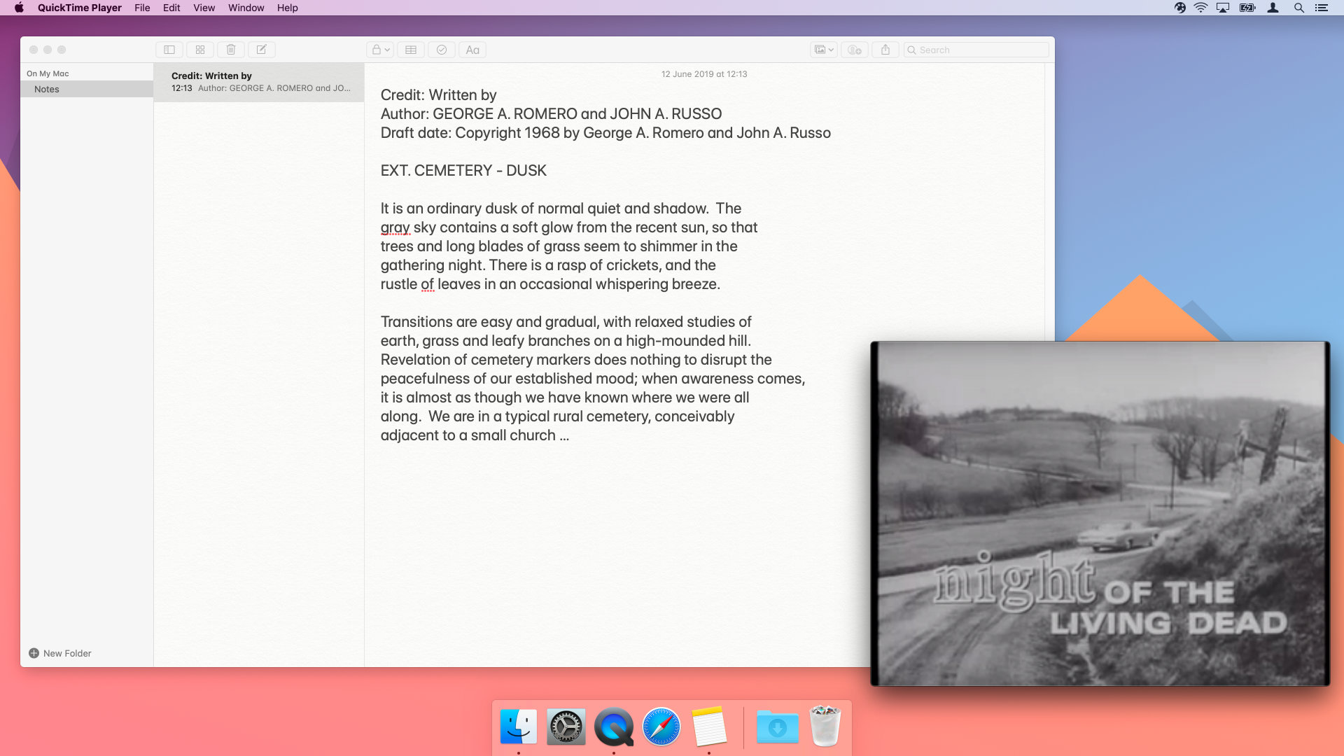
A screenshot of a desktop where Pipvid puts VLC in the bottom right corner

Pipvid automatically enables float-on-top for the player window and can optionally ensure the window video remains visible on every Space. The window snaps to any corner, of any screen attached to your Mac.

You can try Pipvid for free for 10 minutes at a time. Once you’re convinced, you can purchase a license through Gumroad.