Homepage and news overview redesigns
September 2019
I made some changes to the website that are worth sharing. In this post I’ll show you what’s different and in a follow-up I’ll go into detail about customizing my Jekyll theme.
Homepage
Before: 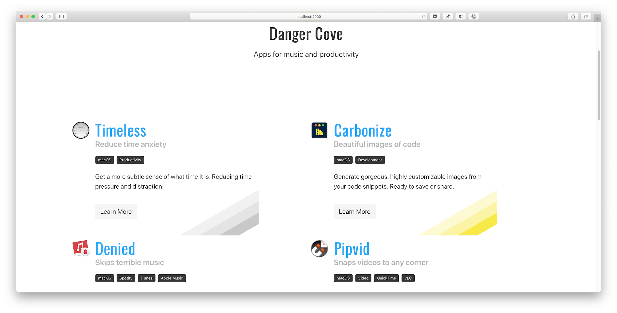 After:
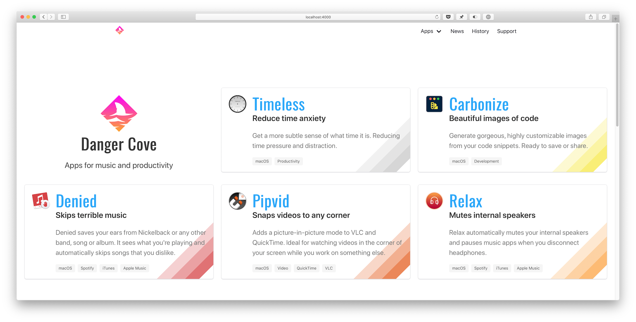
In the initial design the logo and tag line took up the entire screen. Scrolling was required to read about the apps. I can see what I had intended, but in practise it didn’t work well.
The new layout focusses on the software. It feels more compact and easier on the eyes. Note how the updated ‘cards’ clearly point out the app’s name and subtitle, conveying its purpose in a glance.
What do you think? Better, worse? Could it be improved? You can let me know on Twitter.
News overview
Before: 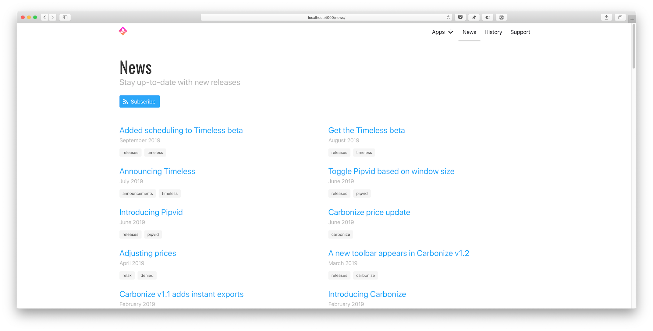 After:
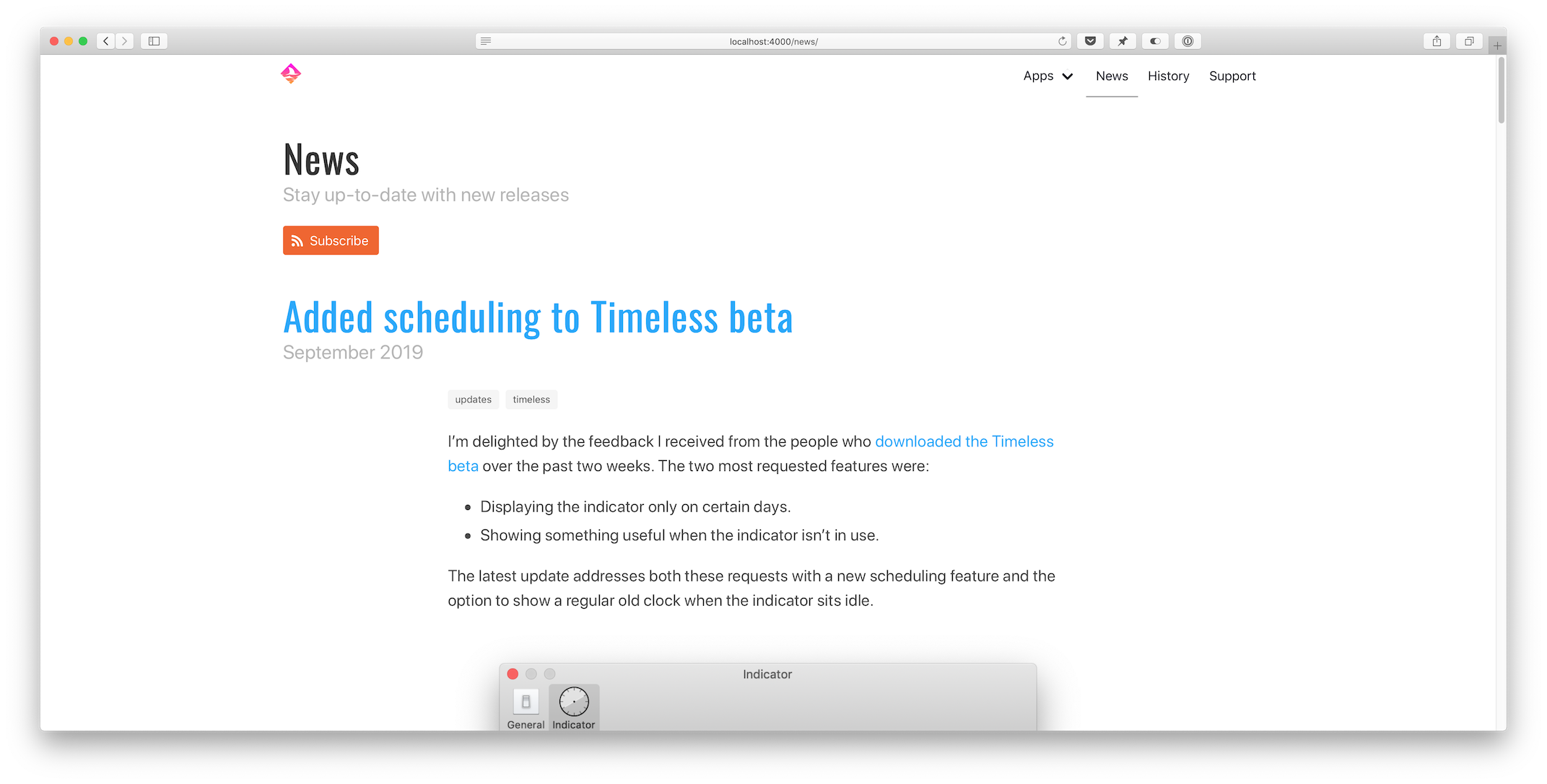
The news page bothered me for a while. The old template showed an endless list of post titles. I’ve written quite a few articles over the years and this mess didn’t invite anyone to read them.
In the updated situation it shows everything right on the overview. There’s no reason to not scan the first post. The results are paginated. Each page shows up to five entire stories. It’s effortless to keep reading.
Related apps
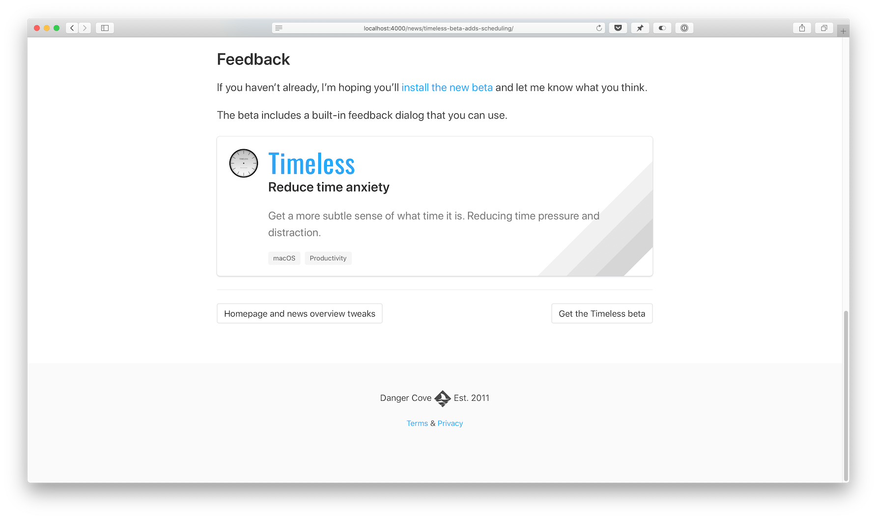
This is a new feature. Underneath each post it shows the apps that were mentioned. I struggled with directing readers from an article to an app. This might just solve it.
You might notice some new colors, adjusted margins and paddings as well. Nothing too radical. In the next post I’ll tell you how I implemented the major changes.