Implementing the homepage and news redesigns
September 2019
As promised, in this second part of the website redesign story I’ll go over the technical details of the changes I made to the website.
Stack & frameworks
To get a sense of how the website’s built, here’s an overview of what I use to layout and serve its content.
It’s a simple setup. The entire site is statically generated by Jekyll and then served by Netlify. Bulma is a CSS framework that allows me to style templates quickly.
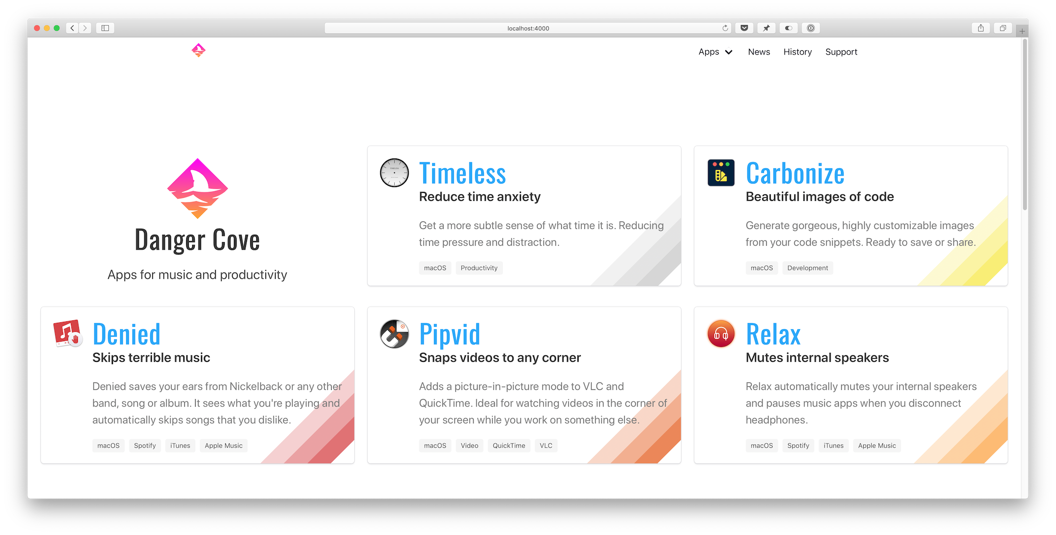
Homepage
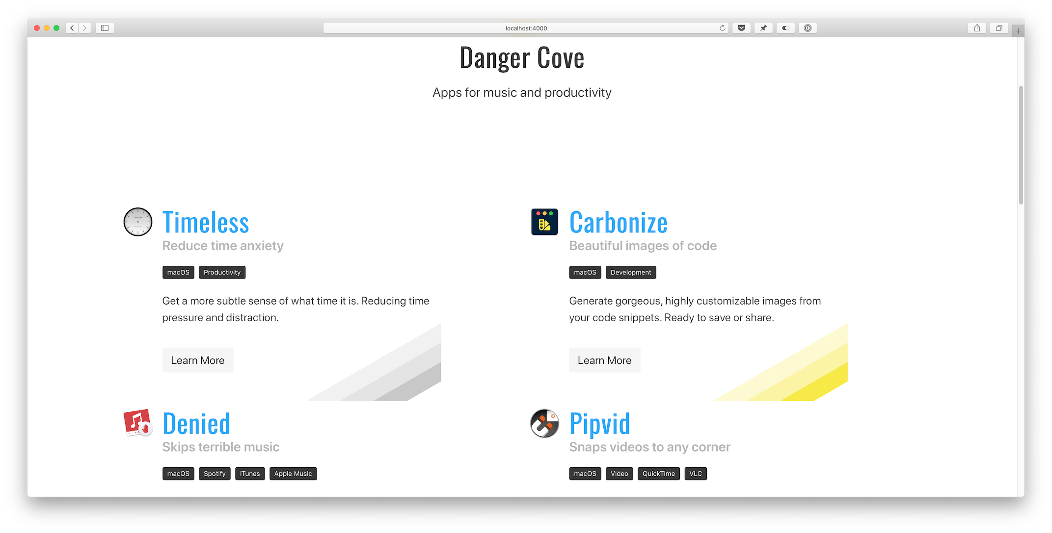
Let’s take a look at the homepage first. The list of apps is generated by including the app/overview.html template and assigning it a set of apps pages.
{% assign live = site.pages | where: 'layout', 'app/live' %}
{% assign announced = site.pages | where: 'layout', 'app/announced' %}
{% assign apps = announced | concat: live %}
{% include app/overview.html apps=apps %}
I fetch the apps to display by querying site.pages for pages that use the app/live and app/announced layout. Then I concatenate both arrays into a single apps variable and pass that to the includable app/overview.html template.
Overview template
The app/overview.html template checks if it’s on the homepage (if page.layout == "home") and adds the Danger Cove logo accordingly.
...
{% if page.layout == "home" %}
<div class="column is-4-widescreen is-half-desktop is-full-tablet is-full-mobile">
  <div class="box is-shadowless has-text-centered">
    {% include logo/retro.html %}
    <h1 class="title is-size-2-mobile is-1 is-spaced">{{ page.title }}</h1>
    <h2 class="subtitle is-size-5-mobile is-4">{{ page.subtitle }}</h2>
  </div>
</div>
{% endif %}
...
Then it loops over the provided apps and includes app/introduction.html for each. This is the actual visual representation of the app, in the form of a card. Pulling it out into a separate include makes it trivial to display the app card anywhere else. I’ll use it again when showing related apps with blog posts. More on that a little further down.
...
{% for app in apps %}
<div class="column is-4-widescreen is-half-desktop is-full-tablet is-full-mobile">
  {% include app/introduction.html app=app %}
</div>
{% endfor %}
...
Notice the convenient column CSS classes that Bulma provides. It’s trivial to scale the layout from mobile to widescreen devices.
Front matter
The app/introduction.html template pulls the title, subtitle, description and colors from the app’s front matter. This is what the front matter for Timeless looks like:
---
layout: app/announced
site_title: Don't get distracted by time
title: Timeless
subtitle: Reduce time anxiety
description: >-
  Get a more subtle sense of what time it is. Reducing time pressure and distraction.
date: 2018-07-18
icon: timeless-clock_512.png
hero:
  icon: timeless-clock_512.png
  dominant_color:
    r: 200
    g: 200
    b: 200
features:
  - Specify several, customizable 'time segments'.
  - Indicates the current segment in the menu bar.
  - Display the actual time and date with a single click.
tags:
  - macOS
  - Productivity
topic: timeless
mailchimp:
  interests: [2]
permalink: /timeless/
---
Every card shows a specific rainbow of colors in its bottom right corner. Storing this information in the page’s front matter allows me to pull it out in the template and apply per-app design details.
{% assign color = app.hero.dominant_color %}
<div class="box" style="background-image: linear-gradient(135deg,
transparent 80%,
rgba({{ color.r }}, {{ color.g }}, {{ color.b }}, 0.25) 80%,
rgba({{ color.r }}, {{ color.g }}, {{ color.b }}, 0.25) 85%,
rgba({{ color.r }}, {{ color.g }}, {{ color.b }}, 0.5) 85%,
rgba({{ color.r }}, {{ color.g }}, {{ color.b }}, 0.5) 90%,
rgba({{ color.r }}, {{ color.g }}, {{ color.b }}, 0.75) 90%,
rgba({{ color.r }}, {{ color.g }}, {{ color.b }}, 0.75) 95%,
transparent 95%)
;">
...
It’s hard to get around using style="" for this loop. On the app’s landing pages I apply the colors to a generic CSS class that I can use in the template.
...
{% if page.hero.dominant_color %}
{% assign color = page.hero.dominant_color %}
<style>
  .hero-app {
    background: linear-gradient(35deg,
    transparent 60%,
    rgba({{ color.r }}, {{ color.g }}, {{ color.b }}, 0.25) 60%,
    rgba({{ color.r }}, {{ color.g }}, {{ color.b }}, 0.25) 70%,
    rgba({{ color.r }}, {{ color.g }}, {{ color.b }}, 0.5) 70%,
    rgba({{ color.r }}, {{ color.g }}, {{ color.b }}, 0.5) 80%,
    rgba({{ color.r }}, {{ color.g }}, {{ color.b }}, 1) 80%,
    rgba({{ color.r }}, {{ color.g }}, {{ color.b }}, 1) 90%,
    transparent 90%);
  }
...
Setting class="hero-app" atomatically applies the rainbow background for each app.
News overview
Before: 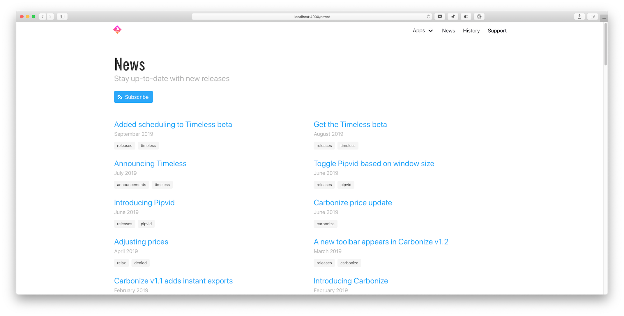 After:
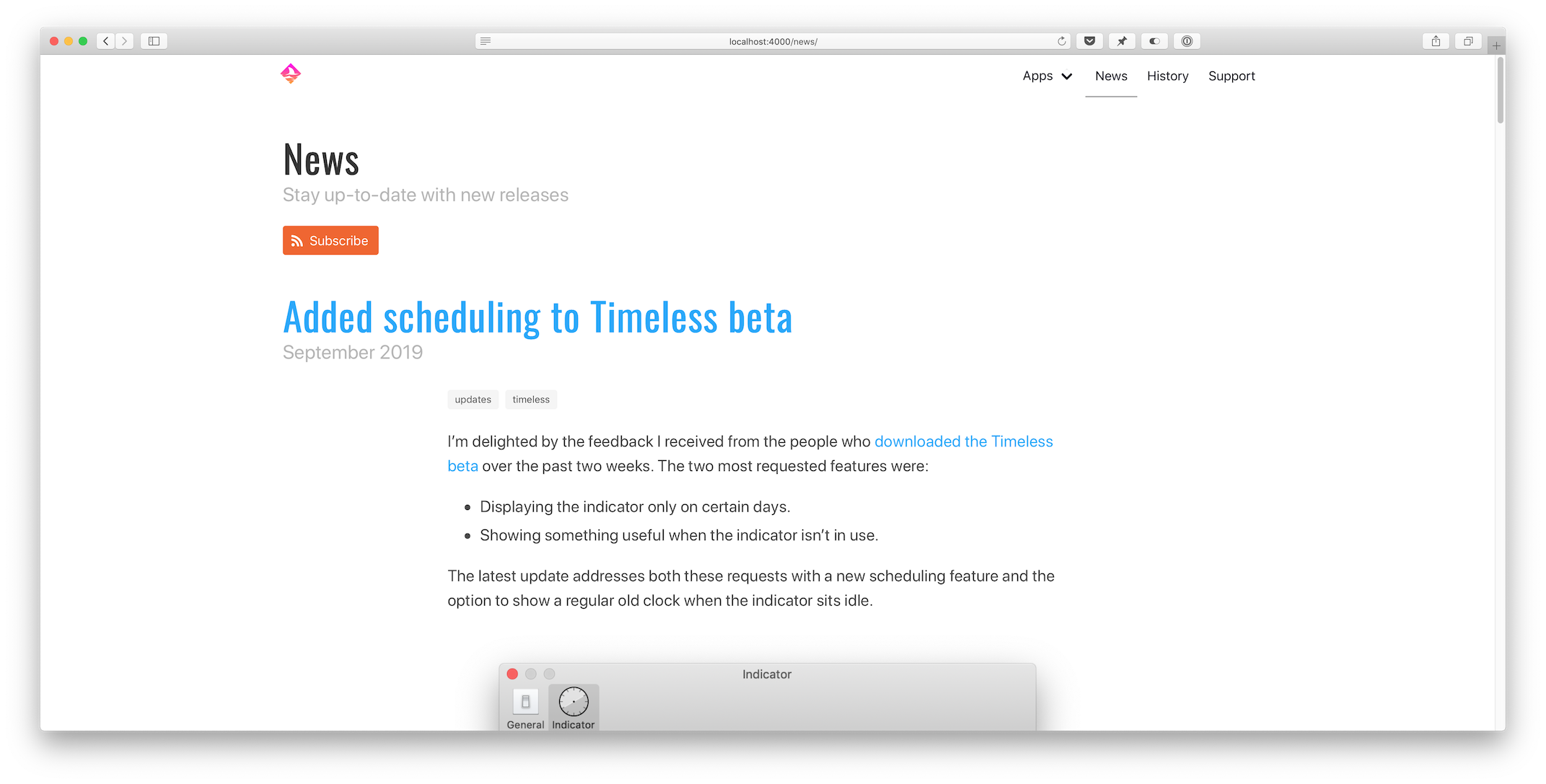
Pagination
Loading all posts on the /news page would be madness. The first step I took was to implement the jekyll-paginate-v2 plugin:
- Add
gem "jekyll-paginate-v2"toGemfile:group :jekyll_plugins do ... gem "jekyll-paginate-v2" end - Activate the plugin in
_config.yml:plugins: ... - jekyll-paginate-v2 pagination: enabled: true sort_reverse: true # Required in my setup to order posts from new to old permalink: "/page/:num/" - Add pagination settings to the
news.markdownfront matter:--- ... pagination: enabled: true per_page: 5 ---
The pagination plugin is ready to be implemented in _layouts/news/home.html at this point. It comes down to two things:
- Replacing
{% for post in site.posts %}with{% for post in paginator.posts %}in the template. - Including the paginator controls somewhere on the page.
Full post content
I updated _includes/post/preview.html to show the entire post instead of just a preview. That’s it.
Related apps
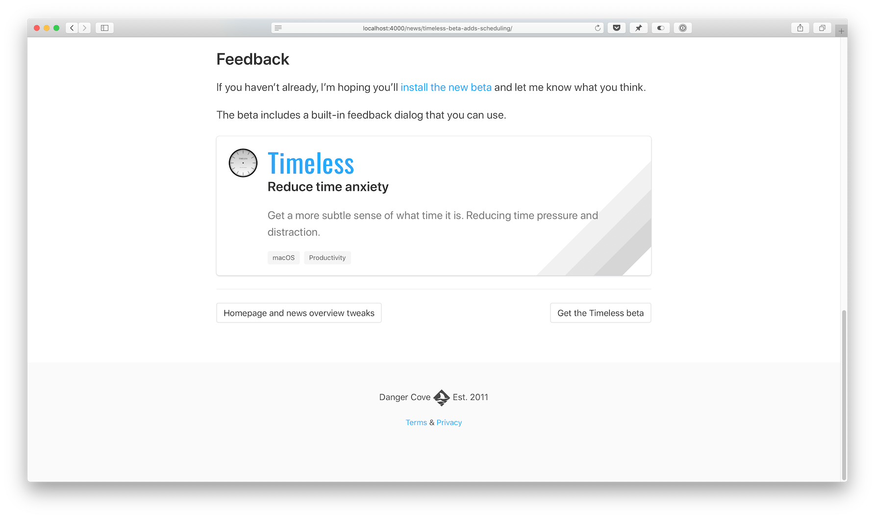
This new feature uses some front matter magic to allow me to pull in related content with a blog post. Consider the _includes/post/related.html template:
{% assign tags = include.tags %}

{% for tag in tags %}
{% assign app = site.pages | where: 'topic', tag | first %}
{% if app %}
{% include app/introduction.html app=app %}
{% endif %}
{% endfor %}
Usage: {% include post/related.html tags=post.tags %}
It loops through all tags assigned to a post and then searches site.pages for a page that has a topic that matches the tag.
Imagine I write a post about Timeless and tag it like this:
---
...
tags: [updates, timeless]
...
---
If you look in the front matter for Timeless above, you’ll notice its topic:
---
...
topic: timeless
...
---
The app variable gets assigned and the app/introduction.html card template gets included. If the tags include multiple apps, each is shown.
Open-source
The full source code for this website is available on GitHub. For a comprehensive list of all changes made for this redesign, take a look at this diff: 3493aae..4518428
I hope you enjoyed this in-depth look at how I keep dangercove.com up-to-date. If you have any feedback, questions or comments let me know on Twitter.
 After: